
An FX chart is a visual tool to show a currency pair’s past price movements. The map of its movements can be used to predict its future changes, in which to enact speculation, hedging, or arbitrage.
Candlestick charts originated as a measurement tool in Japan in the 18th century to anticipate the price of rice. Charles Dow (co-founder of Dow Jones and Company) brought them to the attention of the Western Hemisphere, and were then popularised by a trader, Steven Nison, in his book ‘Japanese Candlestick Charting Techniques’ published in 1991.
FX charts can be in the form of line charts, bar charts, or candlestick charts. The most widely used is candlestick charts, especially on an institutional level.
Below shows a typical candlestick chart for the major pair GBP/USD.
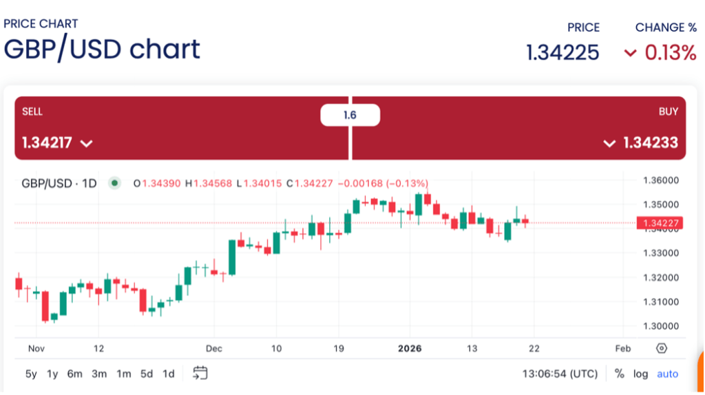
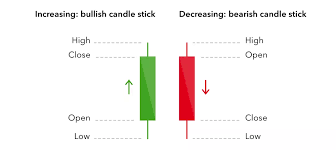
The horizontal bars are each a ‘candle’ which represents a time duration, usually a day, but can be adjusted to be a week or a month. The four main features are the open price, the high price, the low price, and the close price. A candlestick with a longer time frame, like a week or a month can portray more reliable trends, a shorter time frame, such as an hour can show more detailed movements, but more movements can equal more noise.
Open price – the first trade during the specified period. (i.e. the first trade of the day).
High price – the highest traded price during the specified period.
Low price – the lowest trade during the specified period.
Close price – the last trade during the specified period.
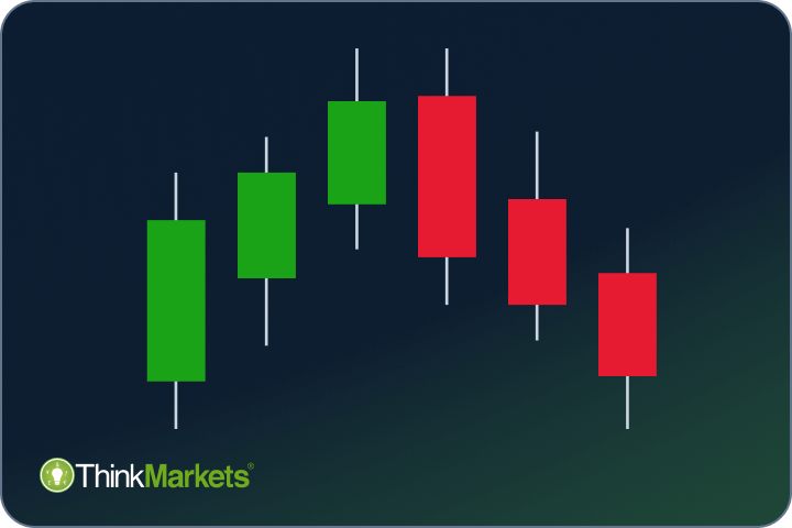
The image below illustrates this. The colour of the candlestick is an important factor.
A green candlestick reflects a bullish market, as the closing price was higher than the opening price. This suggests buyers have control.
A red candlestick reflects a bearish market, that the closing price was lower than the opening price. This suggests sellers have control.
The shape of the candlesticks can give indicators about what’s to come next, as they can reflect market sentiment. A few key themes portrayed from the following description of candlesticks and their patterns is the importance of a bearish or a bullish signal, and whether it is a sellers and a buyer’s market.
These include:
- Doji (gravestone, long-legged, and dragonfly)
A Doji (denotes its name from its Japanese translation meaning ‘the same thing’) occurs when the opening and closing prices are almost identical, with a short vertical body, and long wicks. A Doji can indicate that the preceding change can go either way, it exemplifies indecision within the market.
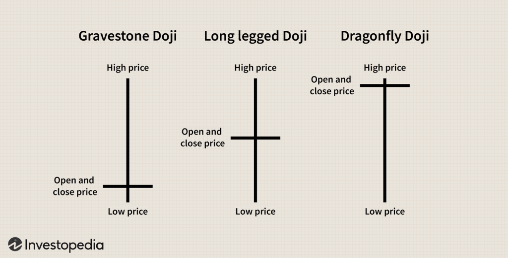
- Gravestone Doji: This upside-down T ‘gravestone’ shape can signal a potential end of an upward trend, and an incipient downward movement in price action may be forthcoming, i.e., bearish reversal. It can depict traders exiting long positions and/or entering short positions.
- Long-legged: An equal plus + shape Doji, out of these three Doji candlesticks is the most indecisive signal, the closing price and opening price are identical, signalling the market is conflicted, traders may wait for the next candlestick to act.
- Dragonfly: This cross-shaped Doji is the opposite of the gravestone Doji and its signal. Again, similar to the latter two examples, both closing and opening prices are almost identical, an incipient upward movement could ensue – a bullish reversal signal.
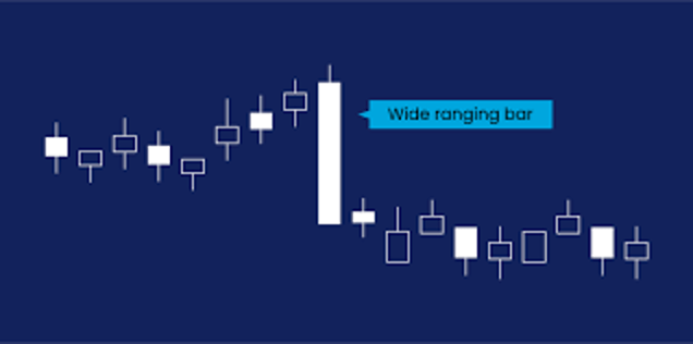
2. Wide-ranging Candlestick
A wide-ranging bar looks like a long vertical bar, usually 2-3 times the length of any surrounding candlesticks. As depicted below it is easily identifiable, disrupting a pattern. This bar illustrates the open and close price had a substantial difference. A wide-ranging bar in the upward direction, is a strong market indicator, of upward movement. (below). A wide-ranging bar in the downwards direction is strong downward market momentum.
3. Hanging Man & Hammer.
A hammer candlestick and hanging candlestick are essentially the same candlestick in shape, whereby there is a long lower wick, a small body near the top, and little to no upper wick. What determines whether a candlestick falls into each category here is dependent on the surrounding candlesticks.
- The hanging man is indicative of a bullish reversal. It tells a story that even though during the time period, such as over the course of a day, that even though market prices open high, but prices initially dropped much lower. Ultimately, buyers stepped in enough to reserve this decline, and sustained this through the end of the day. Indicating buyers are in control.
- Hammers are still identical in shape but can be a bearish reversal of they can be a consequence following a continued downward trend. Hammers are a reliable dictator after a prolonged duration of downward movement, insinuating market sentiment is improving. Under the same precedent as hanging man, buyers are still in control.
4. Inverted hammer and Shooting Star:
This category is the reverse of the previous, where there is a small lower wick, a small body near the bottom, and a large upper wick. Repeatedly, the shape is the same for inverted hammer and shooting star, but what determines if it is one over the other, is relative to the surrounding situation, likewise, to hanging man and hammer, but upside down.
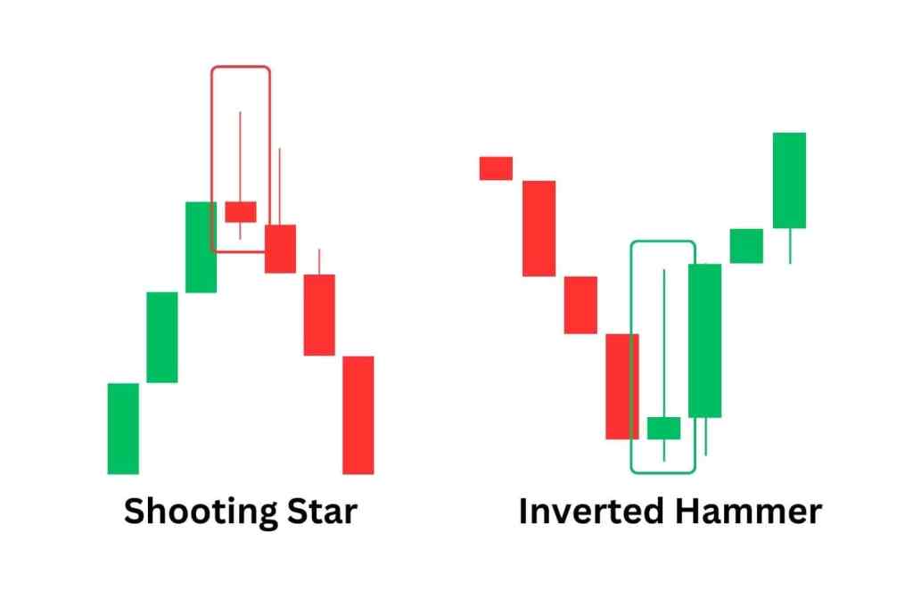
- The inverted hammer would typically appear when prices have been declining, and a bearish reversal signal may proceed. The long top wick represents a narrative that buyers have been trying to push the price up, but sellers are creating some resistance towards the latter half of the time period or trading day, sellers are therefore in control.
- A shooting star would usually occur after prices have been increasing, and a bullish reversal could ensue. This shows buyers have been pushing up prices during the time period, but sellers remain in control and pushing down the prices close to what they opened with up until the close.
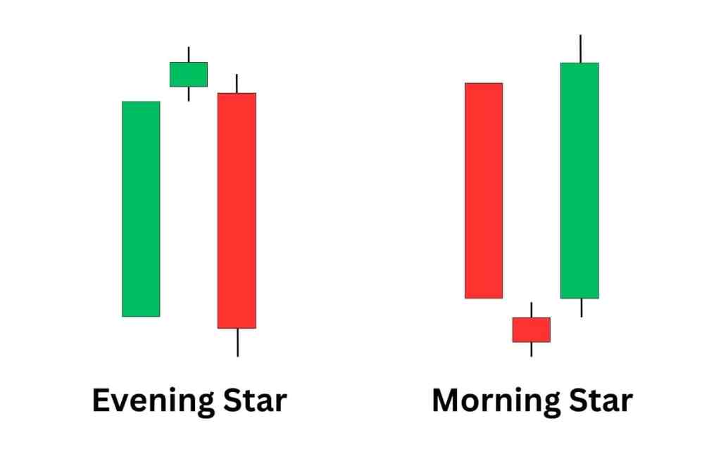
5. Evening star and Morning star:
This candlestick is a small-bodied, with short wicks at either end, which are usually equal. They show traders are pausing, with little difference between the time durations’ high and low, plus compared to the open and close. The candlesticks importantly appear above or below a previous wide-ranging candlestick, and subsequent wide-ranging candlestick followed, with no overlap over the bodies.
- An Evening star candlestick, can signal a reliable signal for a bearish reversal, appearing after a peak of uptrends, and can illustrate a moment of pause, where traders do not know if the upward will continue, it is neither a buyer nor a seller’s market for a moment. The following candlestick wicks may be longer, even if the body is still wide-ranging, this portrays a glimpse that sellers are starting to take over and could push down the trend.
- A Morning star alternatively follows a downward trend, where the previous wide-ranging candlestick has little to no wick, the short body and short wicks repeatedly depict a pause. It is then proceeded by a minute maintenance of the upward trend, but buyers are gaining the slight upper hand and could push up the trend.
Triangles, Flags and Wedges:
The discussion on candlesticks is based on the premise that the time period for each candle is single trading day. When these daily candlesticks are plotted across weeks or months, other patterns can then be discovered from the shapes these candlesticks create. constituting triangles, wedges and flags, which are further indicative tools in which to analyse past movements over a larger time scale and predict future movements further ahead beyond a day.
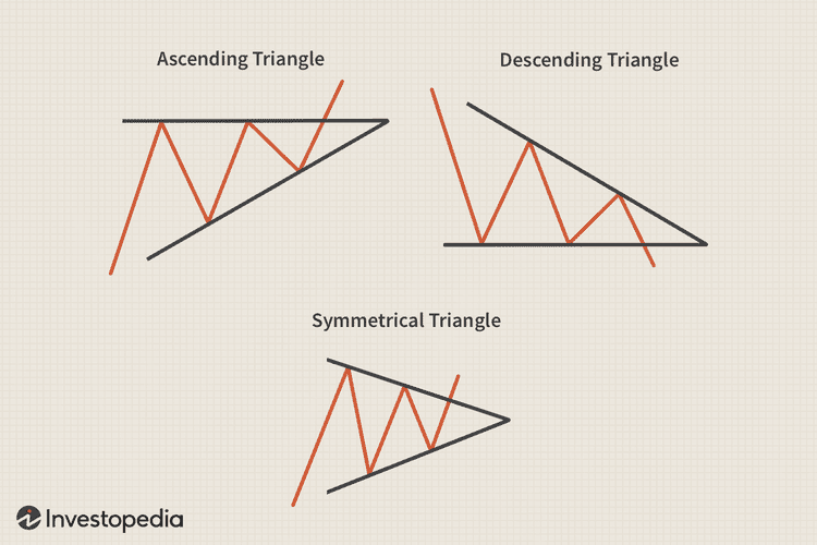
- Triangles (ascending, descending and symmetrical):
- An ascending triangle is a breakout pattern, which is created when a price breaches the straight horizontal upper trendline; this signals a bullish signal. For a pattern to constitute as an ascending triangle, the upper trendline has to be horizontal, which is the resistance line, in which forms a break line – essentially a glass ceiling which has to be broken. This suggests a dominance of higher highs over lower lows. Buyers are dictating this movement, breaking the resistance glass ceiling potentially due to a lack of patience at the current price.
- A descending triangle is the same situation, alliteratively there are more lower lows over high highs, creating a downward triangle. Sellers are more in control of the market, there is also the glass ceiling called the resistance level, which is pushing down the price. The glass floor, which is the support price holding up the price to a certain level, would be breached by impatient selling off at higher intensity, since it’s a seller’s market.
- Symmetrical triangle is the third option whereby sellers and buyers are at equal odds with one another. There are equal, high highs and low lows. The consequential peaks and troughs, which are the resistance and support price collide to a middle converging point, creating a pause for the next direction. The precipitating reaction could go either way. Which way the trend breaches the resistance line, whether it is the glass ceiling or glass floor, is a slight predictor for the incumbent reaction.

Leave a comment